

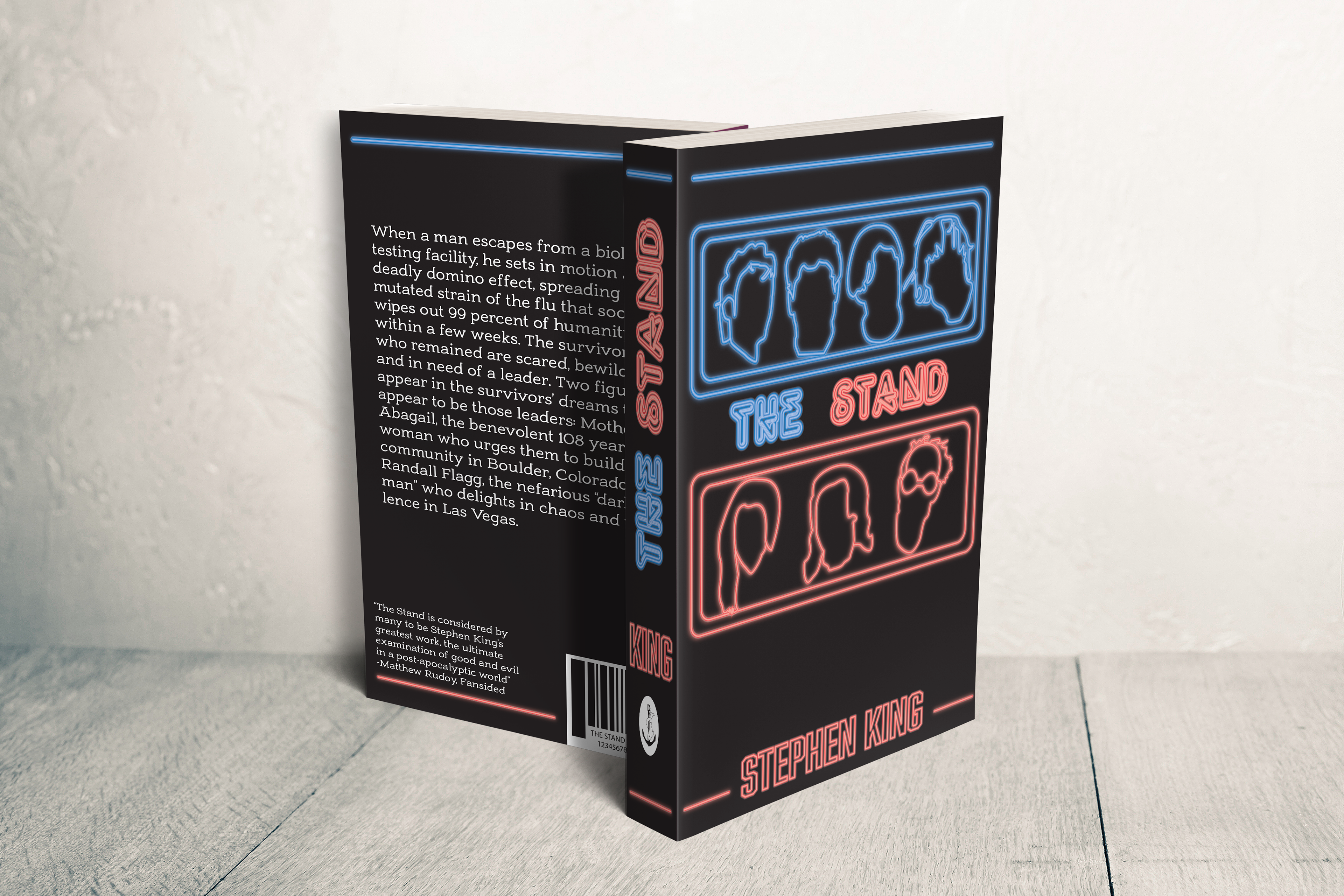
The final project for my Illustrator class at JWU tasked me with creating a book cover for a book of my choice, so I decided to design a cover for “The Stand” by Stephen King. I was inspired to choose “The Stand” because the 2020 TV adaptation was starting to premier and in anticipation for the show, I started re-reading the book. All 1,152 pages of it.
I made some heavy revisions when I revisited the project for my portfolio. My biggest change was following the suggestion to change the color of the secondary text on the book (summary, reviews) from red to white. This was because the dark red was clashing with the black cover, which made the text incredibly difficult to read.
My next change was the secondary text font. I originally used Abolition, which is a caps-only font, that also contributed to making the text near illegible. I changed the font to Adorns Slab Serif, to improve readability, and to contrast the primary font of the cover. Finally, I changed the title on the spine so the text is on one baseline.
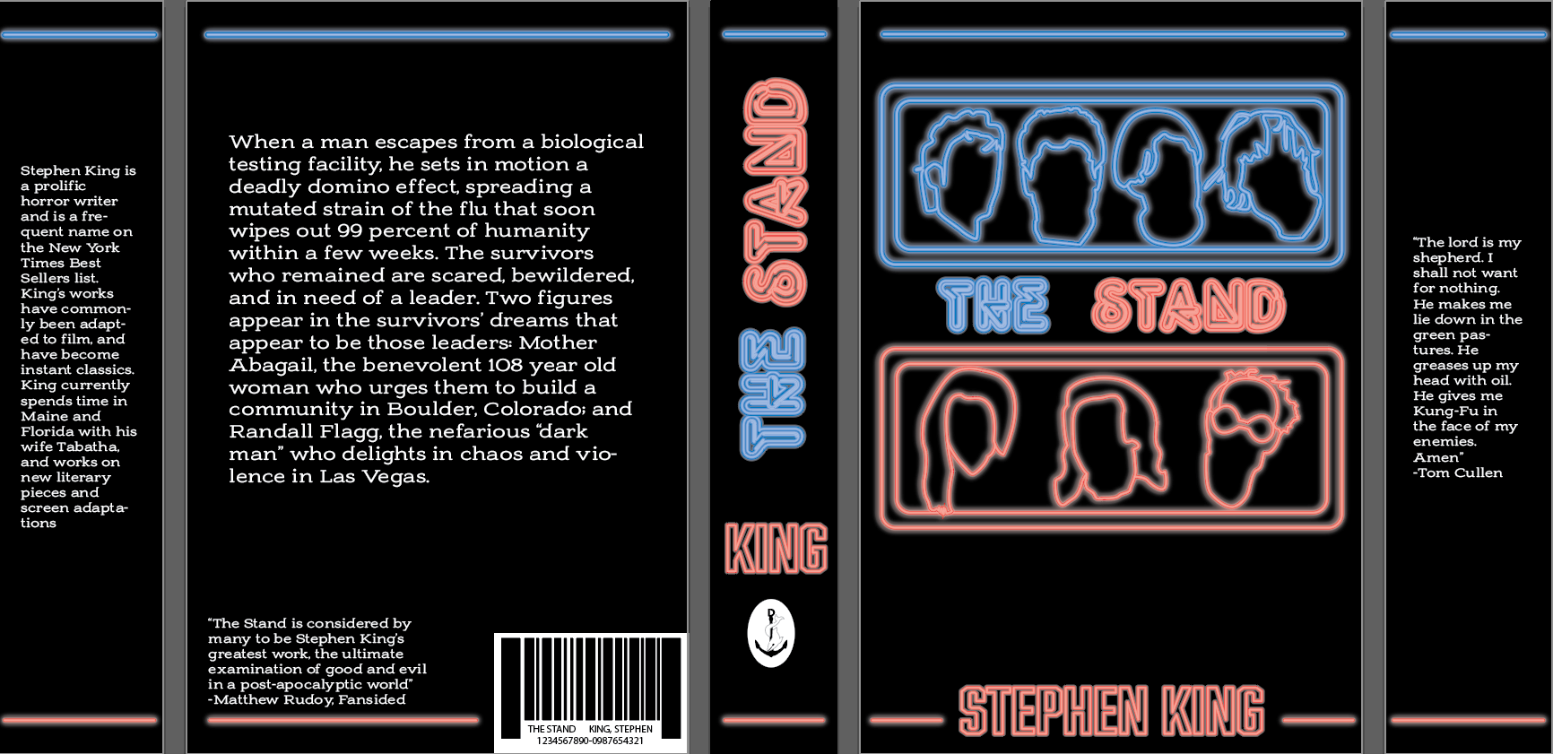
full cover